amarok distraction
July 31, 2008
From my last blog entry, some people inquired about using the amarok image as a splash screen. Not necessarily what I intended, but a cool idea nonetheless. It wasn’t ideal since it had a tiny, tiny KDE logo and “Be Free” text. So I went back and tweaked that image as well as some others.
If you’re asking, “Wade, that’s all well and good, but how the hell does this merit a blog entry? Why don’t you just post to kde-look.org, shut up, and call it a day?” Great question. I have no idea why. Probably because I wanted to finish one of my twenty half-written blogs today, but got to daydreaming on this and guilted myself into calling it a blog entry. You satisfied?
Here’s the slightly tweaked version that’s a bit more appropriate for a splash screen (one that is a good choice for a release candidate that refers to the anticipation of the final release):

The blue seems to contrast well with the washed out earth tones. But if you want more vibrancy, here’s an image that I was originally saving to tie into a series about Phonon. I may have to repurpose it:

Maybe it refers to the devs’ sleepless nights and coding marathons. Too busy? Not enough color saturation? Here’s another originally intended for Phonon. Maybe it’s a double entendre about the final release:

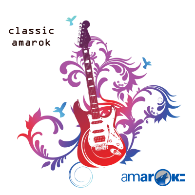
And finally, if you don’t upgrade to 2.0 and choose to stay with the 1.4 series, you can use this one:
Larger versions on my Picasa web album as usual. Ending transmission.

July 31, 2008 at 5:59 am
Just to note: while the Fender Stratocaster is the quitisential electric guitar, the headstock shape is trademarked, and the body at least has a trademark application in…
Not sure how that affects the freedom of that last image. I really don’t know.
July 31, 2008 at 6:15 am
Very nice, especially the first one.
July 31, 2008 at 6:20 am
You are amazing!
July 31, 2008 at 6:24 am
Those are sweet Wade! You can be sure we will be putting them to good use! 🙂
– Nikolaj
July 31, 2008 at 6:53 am
Wade dont worry the images justify the blog entry 🙂
July 31, 2008 at 8:06 am
They are great.. but I’m not sure that putting English text on a splash screen is a good idea. It could be a problem for i18n.
Actually, if you cut the top of your first splashcreen (the part with text on it), it’s perfect ! And it may fit better on a wide screen (they’re becoming more and more common now…)
July 31, 2008 at 9:02 am
I like the first image a lot, describes it to a T but, oh, that last one is gorgeous.
I’m going to make it transparent and feather it for a1.4 on my k3.5.9.
Thanks =)
July 31, 2008 at 10:04 am
They are lovely!
July 31, 2008 at 10:08 am
great work! i love the “amarok all night.” one. very nice placements of the text and amarok logo.
btw, arent the two stacked stripes behind “amarok” meant to represent the “2” ?
if so, the last one “classic amarok” is slightly wrong :]
July 31, 2008 at 12:29 pm
mofux, those strips don’t mean anything. It’s a logo not a flag. 😀
I think the “are you ready to amarok?” is a good message for a splash screen, no matter what the release is.
July 31, 2008 at 8:20 pm
Wade,
Unfortunately, the one problem with all of those is the same problem we currently have wherever we use that Amarok logo — the lettering, which goes from a small a to an uppercase K after the o: amaroK, which has not been our spelling for about two years now. This is a “feel free to make it Amarok instead” bit of egging on… 🙂
August 1, 2008 at 8:08 pm
I like the first one.
Remove the upper strip and move the ‘Are you ready to amarok ?’ text (in white font color of course) .. to the bottom (on the lower black background) and use a small sized and a very fine font
and it will be perfect